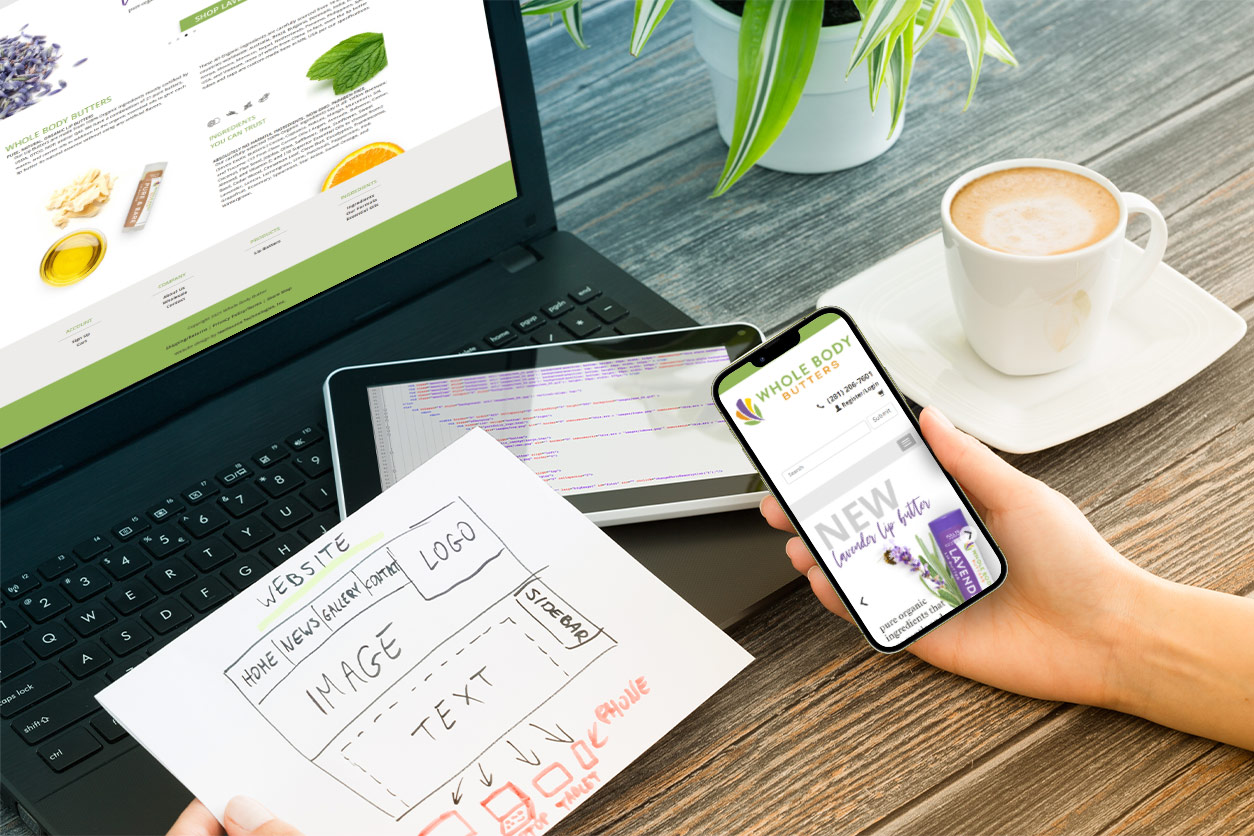
Your e-commerce website usability is vital for your website’s success! Shoppers need to be able to visit your website whenever the need arises, from whatever device they have available. Often times, the most readily available device is a cell phone. Due to this, a major topic during the website build conversation is mobile optimization and mobile responsiveness of websites. ProductCart customers should understand how mobile responsive design in a website’s theme is just as important as the e-commerce solution used to sell its products!
The Quick History of Mobile Responsive Design
As of the late 2000’s and 2010’s, more and more websites were designed to be “mobile friendly.” However, that isn’t the same as mobile responsive. A Mobile Responsive Design is defined as a website design that can be displayed on a mobile device and will automatically adjust its size, layout, and proportions in a legible way to fit the specific device you’re on. Basically, if you have a website, the code in the sites theme when built will decide if it automatically resizes and functions well on certain mobile devices…or not. A website’s theme is the framework of the site. It includes the layout and style of your website design. It’s the code used to create your website that provides the structure, style, and design of a website. All ProductCart designed sites are created to be mobile responsive, now.

Over the years, the ProductCart team has followed best practices in web design to provide customers with an e-commerce store that has as much mobile functionality as possible. How a website displays in the mobile environment, on smart phones, tablets, and other small devices, is an also an important consideration for a site’s search engine ranking, or SEO ranking. Because mobile display is such an important factor for both customers usability and SEO value, it’s important to ProductCart!
Though ProductCart software works with mobile optimized websites, the software cannot make a site that is not currently mobile optimized, function responsively on mobile devices.
ProductCart Customers and Their Sites
So what does all of this mean for your ProductCart site or third party site with ProductCart software? Here are the details!
ProductCart Versions 5.0 and Beyond
In earlier versions of ProductCart – everything before the arrival of version 5.0 – mobile usability was provided through the use of a separate set of display files that were used when the site was accessed on a smart phone browser. The mobile display files were a limited approach, however, and required considerable additional work to correctly implement. All versions since ProductCart 5.0 – including the new v5.4 release – replace the mobile file set with a single display file set, or theme, that uses a mobile-responsive approach to the site design. Mobile-responsive design gives a single theme the ability to display accurately on a wide range of devices by using the popular Bootstrap framework as the basis for all user-facing pages.
But…and this is an important caveat, ProductCart’s use of a mobile-responsive design framework doesn’t mean that your website will magically become properly mobile-responsive just because you’re running version 5-whatever of the software. Think of ProductCart’s Bootstrap framework as ‘responsive design ready’ and you won’t be far off the mark. If your website’s theme is mobile responsive, an online store powered by ProductCart will render your website on mobile devices!

Mobile Responsive Design for Custom Websites with ProductCart
If you use one of ProductCart’s four standard Bootstrap themes, in a mobile environment the website will work properly without any more adjustments. For custom site designs, we recommend starting with the framework of the stock Bootstrap Clean theme and building out the customizations from that design core. You’ll want to make sure your site’s designer or developer has good working knowledge of both the general principles of mobile-responsive design and of the Bootstrap framework. Otherwise, even with the mobile-responsive capabilities built-in to the framework, you’ll end up with a site that doesn’t always display correctly across the full range of mobile devices and screen sizes.
Is your ProductCart website mobile optimized?
Was your website built recently? Is it mobile responsive? If you’re not sure, contact us! The ProductCart team can review your current ProductCart website or create a new one for the latest mobile optimized experience!


