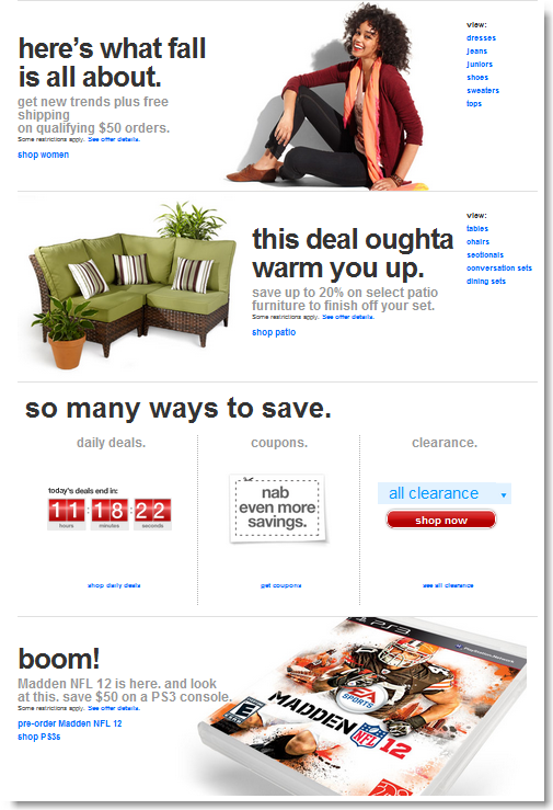
Target Brands, Inc. just relaunched their ecommerce store at target.com. I don’t know about you, but when we see a $1.3 billion online store go for a full redesign, we like to take a good look and see what they’ve come up with.
Hey, they must have spent a fortune researching all kinds of customer behaviors and purchasing patterns, and our market research budget is a bit smaller. So, let’s see if we can pick up a few tips here and there.
First off, the home page looks like one of those nice, colorful flyers that you find in the Sunday paper. It invites you to scroll down vertically with big graphics and large fonts. It seems to say: our store is easy to browse: scroll away!
Notice also how it gives the user a lot of different options as to how to browse different sections of the site, but without overwhelming the visitor with more than just a few links in each section.
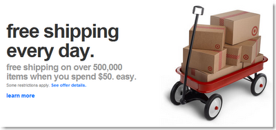
By now, everyone knows that loads of research has been done indicating that free shipping is what online shoppers want, and Target makes sure you know they provide that, with a big graphic and large statement close to the top of the home page.
We started browsing the store, visited a few product details pages, and…. well, we had to include this for our development team: hey guys: regardless of the development budget, a little bug is always ready to sneak in!! Here’s what we got when we added a harmless pair of pants to the cart.
OK, back to the store design. The overall graphical interface is very much a minimalist one, where product and category names and images really take center stage. The top is just a simple banner that includes a very visible search feature and category navigation.
The search feature includes an auto-suggest feature (a ProductCart reseller recently published an add-on for ProductCart for this, called “
Predictive Search“), and a product preview feature in the search results (which can be turned on and off in ProductCart).
Overall, it’s a store design that definitely focuses on simplicity: an uncluttered design that does feel fresh and less overwhelming than its giant competitor Amazon.com (whose technology Target used until recently).
We liked it. What do you think?


