Product photography is one of the biggest selling points in an ecommerce website. Without being able to visit a tangible store and touch, smell, hear or taste the product, potential customers only have images to interact with, and according to this infographic, more than 90 percent of buying decisions are influenced by visual factors. In other words, cell phone photography or pictures from your early 2000s point-and-shoot camera just aren’t going to cut it if you want to be successful in ecommerce.
One ProductCart store that takes full advantage of the importance of good photography in ecommerce is equestrian apparel website Kerrits. In this blog, we examine Kerrits as an example to give you some ideas on how to maximize the user experience in your ecommerce store and ultimately achieve better sales.
Lifestyle Photos
Photos for your company should be a reflection of your brand, not just your product.
Lifestyle photos, unlike studio shots, are taken outside a studio, in a natural landscape or setting.
A great tool to use is a lookbook, which is a collection of lifestyle photos of your products that often tell a story. Photos in a lookbook should show the products in use, and make it clear how they fit into the customer’s life.
Lifestyle photos also show the size and shape of a product when in use. If you’re selling electronics, you might show a comparison to an everyday item, like a paperclip, to portray the scale of the product. If you’re selling clothing, show how the clothing fits on a person instead of a mannequin.
Keep in mind what kind of products you sell, and take note of what other well-known companies are doing to market to their target audience. The style of your photos should reflect your goals.
Ideally, lifestyle photos should be taken by professional photographers, but here are some great tips for taking your own.
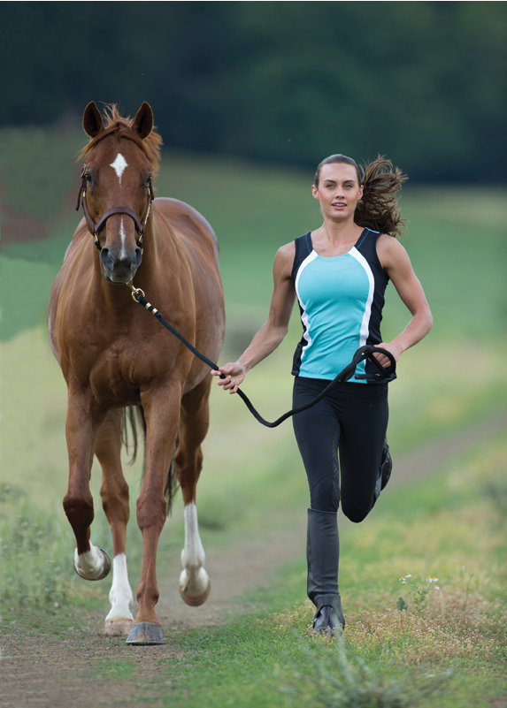
Kerrits does a great job with its lifestyle photos, and the photo above is just one example of many. Instead of only showing the clothing with a stark white background, the photo shows the product in action. Kerrits goes above and beyond in demonstrating this by not only photographing models outdoors, but also including horses in all of their lifestyle photos. They’re not just selling the product; they’re selling the brand – quality clothes and the equestrian lifestyle.
Studio Shots
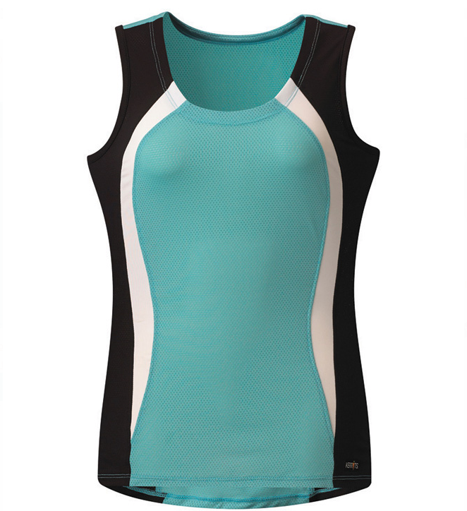
While lifestyle photos are a very useful addition to your website’s collection of product photos, don’t forget the basics. It’s important to include studio shots as well, so the consumer can see details that may go unnoticed in lifestyle shots. These include the type of material used, the texture and highlighted features of the product.
When capturing a studio shot, you can’t go wrong with a simple, white background. You want your product to stand out, so eliminate distractions. Focus on the product, and don’t allow it to be consumed by the background.
Again, Kerrits does this really well. They have a bright, colorful product with clean lines, and the white background doesn’t compete for the viewer’s attention.
If you’re new to studio photography, this product photography how-to gives some very practical advice on capturing the best view of your products.
Lighting
Good lighting is essential to achieve a quality photo. While natural lighting can be great for some products, manipulating light sources is better for products with lots of detail. Don’t worry; it doesn’t have to be expensive to produce a studio-quality photo. Our sister company, NetSource, wrote a great blog on how to achieve a high quality photo on a budget.
Remember, one of the most important things about lighting is giving the customer a true representation of the colors and detail of the product, especially in apparel stores. Don’t let your lighting compromise the look of the product.
Details Matter
In an online store, customers can’t feel the texture of your product or weigh it in their hands. They can only look at it, as if they are looking through a shop window. That’s why it’s so important to make them feel like they can see every detail of the product – it answers questions and gives customers a sense of trust that your company is not trying to hide anything about its products.
Showing off the details of your product can be attained by using a zoom feature. Consumers want to see your product up close, so make sure you use high resolution photos. If you don’t have high resolution photos, a zoom feature will show up blurry, and may hurt rather than help you as it makes your brand look unprepared and unprofessional.
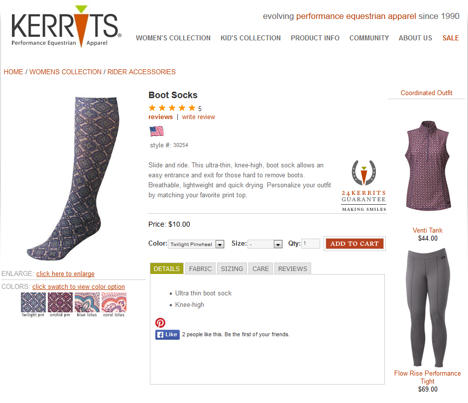
Do you offer more than one color or style of a product? You should include a photo of each choice. Kerrits offers multiple styles and colors of boot socks, and it allows the customer to view each option on the mannequin.
Don’t assume the customer knows what it looks like. There are infinite shades of green, so if you offer a green alternative, show them which shade they’re choosing. Accurate representations will cut down on customer complaints after purchase.
——
Cutting costs for your ecommerce store by skimping on product photography is never a good idea. It takes a little extra investment of time and sometimes, yes, money, but the traffic and sales return you’ll get on showing realistic, quality photos of your products will be well worth it.


