Category: Case Study

  • How to Take Product Photos That Impact Your Bottom Line

    Product photography is one of the biggest selling points in an ecommerce website. Without being able to visit a tangible store and touch, smell, hear or taste the product, potential customers only have images to interact with, and according to this infographic, more than 90 percent of buying decisions are influenced by visual factors. In other words, cell phone photography or pictures from your early 2000s point-and-shoot camera just aren’t going to cut it if you want to be successful in ecommerce.

    One ProductCart store that takes full advantage of the importance of good photography in ecommerce is equestrian apparel website Kerrits. In this blog, we examine Kerrits as an example to give you some ideas on how to maximize the user experience in your ecommerce store and ultimately achieve better sales.

    (more…)

  • CompressionStore drives product reviews by motivating customers to share their opnions

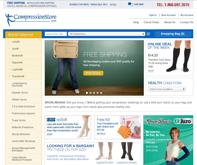
    CompressionStore is a North Carolina-based multi-channel retailer that has become one of the largest online wholesalers of medical compression hosiery. By offering a large inventory of medical compression apparel and a high level of customer service (i.e. free shipping on orders over $50, 150% best price guarantee, and a 180 day return policy), they’ve grown rapidly and become a leader in their niche market.

    compression store home CompressionStore: medical compression apparel

    One thing that they were struggling with, however, was how to encourage customers to write more product reviews. That’s when they decided to experiment with a handy marketing features included in ProductCart called “Rewards for Reviews“: when customers write a review, they get points that can be redeemed against future orders.

    Rewards for Reviews was introduced with ProductCart v4.1, which included many enhancements to the product reviews feature, including automatic, customizable reminders that can be configured to be sent a certain amount of days after an order has been processed or shipped.

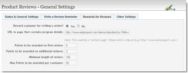
    product reviews general settings
    Rewards for reviews settings in the ProductCart Control Panel

    The Rewards for Reviews feature was created precisely to motivate customers to write reviews by recognizing that their time is valuable and rewarding them for taking some of that time to write a review for a product that they have purchased.

    The feature leverages the Reward Points system in ProductCart to give customers points that they can redeem as cash discounts on future purchases (the point-to-cash conversion ratio is set by the merchant). Learn more about Rewards for Reviews in the ProductCart documentation.

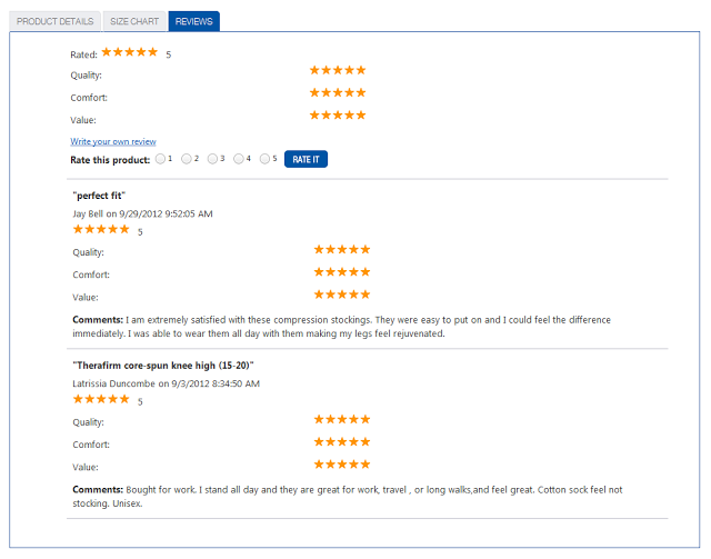
    Since activating this feature several weeks ago, CompressionStore has seen a substantial increase in the amount of product reviews posted by customers: from a few reviews here and there, to several product reviews posted every day. When we contacted them, they indicated that it’s probably still a bit too early to fully quantify the effect of the new campaign, but that they are thrilled with the initial results!

    compression store reviews

    Interested in learning more?

  • New ProductCart case study: Direct Pet Supplies

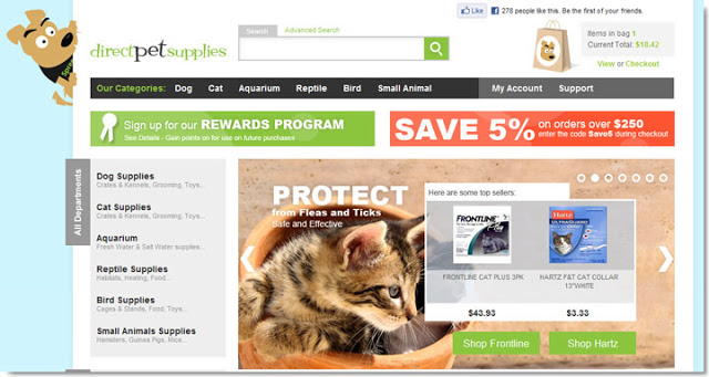
    First of all, we love their mascot. Secondly, they did a fantastic job overall with their ProductCart-powered store. So, meet Direct Pet Supplies, the latest addition to our popular gallery of ecommerce case studies.

    More or less every month, we take a closer look at an online store that uses our awesome shopping cart software, and particularly caught our attention. This month we focused on this fun-looking catalog of over 18,000 pet supplies.

    Direct Pet Supplies Home

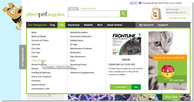
    One of the reason why we like publishing these case studies is that we always learn something new. For example, we loved what Direct Pet Supplies did with the top navigation, incorporating a featured product and a category image next to the list of sub-categories (we had never seen a featured item being incorporated right into the category navigation: what a cool idea!).

    Direct Pet Supplies Topnav

    Read more >>

  • New ProductCart case study: MONO Cases

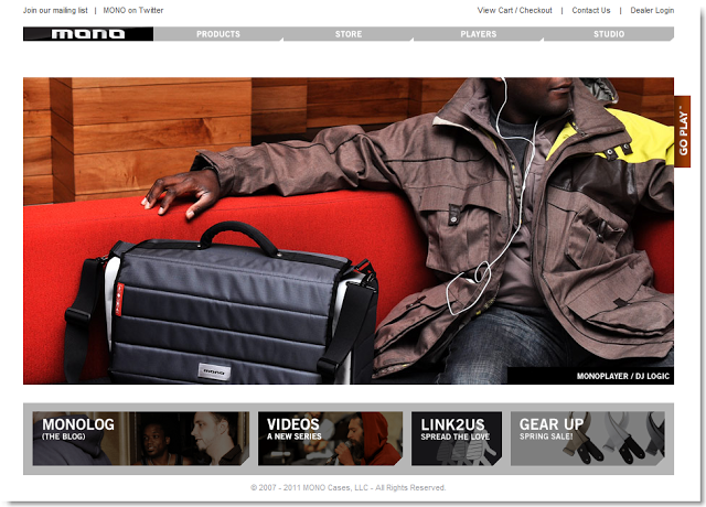
    MONO designs and produces great looking cases for all sorts of musical instruments, backpacks for busy DJs, and many other products. The design in all of their products – modern and clean – gives them a very distinctive personality, while conveying an image of great quality.

    Mono Home Page

    Their ProductCart-powered store blends beautifully with the rest of the Web site, while features such as the product image gallery let customers discover the MONO product line in a very visual way.

    Read more >>

  • Amazon’s new look: what to learn

    We recently published an article about the Target.com redesign. Target launched a new Web store after deciding to run its ecommerce operations independently of Amazon.com, which the US retailer had been using for some time as the ecommerce platform.

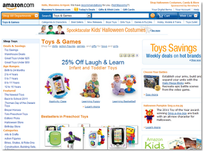
    Amazon too is in the process of launching a new design for their massive online store, and our friends at Practical eCommerce just published an interesting article on what lessons can be learnt from the changes implemented by the ecommerce giant.

    Amazon Redesign

    Among the things noted by Practical eCommerce:

    1. Clean design over cluttered layout
    2. Put search front and center
    3. Interface elements like content sliders can help
    4. Details make a difference (e.g. consider using CSS shadows, which are now supported in IE 9, FireFox 4, Chrome, and Opera)
    5. Focus on visual merchandising

    For more, see lessons from the Amazon redesign.

    One interesting fact about the Amazon – Target divorce: it appears that the folks at Target might have underestimated how difficult it is to scale operations to support huge traffic increases:

    Not easy to run massively scalable ecommerce Web sites! Amazon likely knows more about that than probably anybody else in this industry.

    Smaller merchants should keep this in mind as well: as soon as you can afford it, invest in your hosting infrastructure. Ask your Web host what options you have for more reliability and higher scalability, how fast you can switch, and how much it will cost (and if they don’t reply with a quick, sensible answer, you know it’s time to look at a new Web hosting partner).

  • Getting ideas from the Target.com redesign

    Target Brands, Inc. just relaunched their ecommerce store at target.com. I don’t know about you, but when we see a $1.3 billion online store go for a full redesign, we like to take a good look and see what they’ve come up with.

    Hey, they must have spent a fortune researching all kinds of customer behaviors and purchasing patterns, and our market research budget is a bit smaller. So, let’s see if we can pick up a few tips here and there.

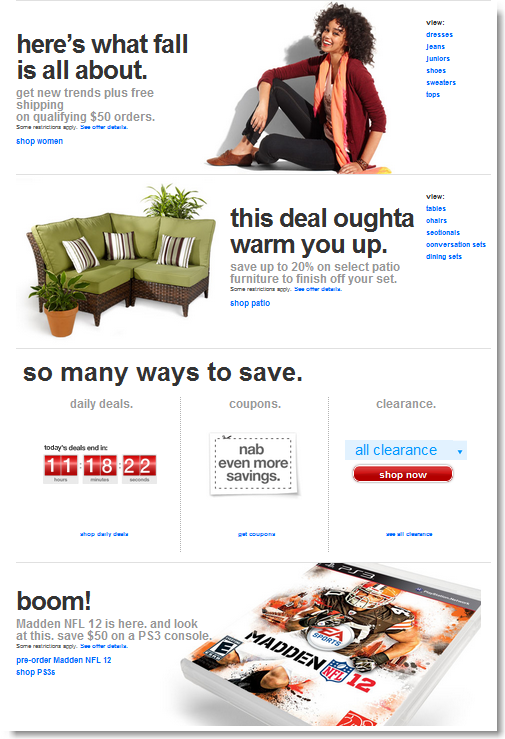
    First off, the home page looks like one of those nice, colorful flyers that you find in the Sunday paper. It invites you to scroll down vertically with big graphics and large fonts. It seems to say: our store is easy to browse: scroll away!

    Target Online Store Redesign
    Notice also how it gives the user a lot of different options as to how to browse different sections of the site, but without overwhelming the visitor with more than just a few links in each section.
    By now, everyone knows that loads of research has been done indicating that free shipping is what online shoppers want, and Target makes sure you know they provide that, with a big graphic and large statement close to the top of the home page.
    Target Free Shipping
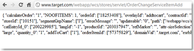
    We started browsing the store, visited a few product details pages, and…. well, we had to include this for our development team: hey guys: regardless of the development budget, a little bug is always ready to sneak in!! Here’s what we got when we added a harmless pair of pants to the cart.
    Target Online Store Bug
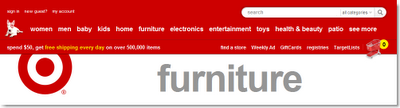
    OK, back to the store design. The overall graphical interface is very much a minimalist one, where product and category names and images really take center stage. The top is just a simple banner that includes a very visible search feature and category navigation.
    Target Online Store Navigation
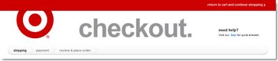
    The header changes at checkout, which is a good idea (this is pretty easy to do with ProductCart).
    Target Online Store Checkout
    The search feature includes an auto-suggest feature (a ProductCart reseller recently published an add-on for ProductCart for this, called “Predictive Search“), and a product preview feature in the search results (which can be turned on and off in ProductCart).
    Overall, it’s a store design that definitely focuses on simplicity: an uncluttered design that does feel fresh and less overwhelming than its giant competitor Amazon.com (whose technology Target used until recently).
    We liked it. What do you think?
  • Mobile Commerce at work!

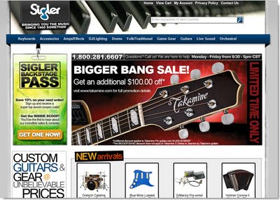
    In the latest ProductCart case study, we took a look at Sigler Music Center, an online music store that is leveraging the ProductCart Mobile Commerce Add-on to reach musicians on the go.

    When we interviewed the company in preparation for the case study, they indicated that around 2% of orders are now being placed through their mobile storefront (ProductCart allows you to run reports to see where orders were placed: regular vs. mobile storefront).

    Read the case study and take a look at some screen shots of the mobile-optimized ecommerce storefront used by Sigler Music.

    Sigler Music Home Page
  • New ProductCart case study: Azar Displays

    Azar has been selling point of sale display systems for over 3 decades, and has been running a ProductCart-powered store for many years. It shows! Take a look at this new case study and learn how attention to details makes Azar Displays a successful, well designed online store.

    This is part of a series of ecommerce case studies that demonstrate how professional online stores are taking full advantage of Early Impact’s feature-rich shopping cart software to run successful online storefronts.

  • New ProductCart case study: Trek Light Gear

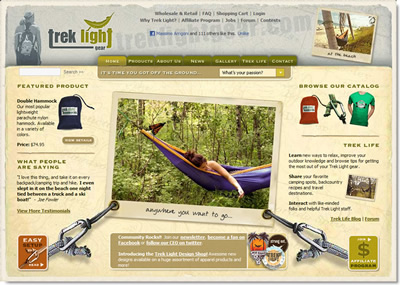
    We just posted a new ProductCart case study to our Web site: Trek Light Gear. The folks at Trek Light Gear have done a great job building and marketing their business, and their online store certainly shows that.

    Trek Light Gear Home Page

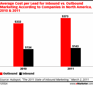
    There is great content for outdoor enthusiasts on the Web site and blog, which is exactly the right way to market your store: as a recent study pointed out, inbound marketing (people come to you because of the value you provide: e.g. interesting articles you write) is much more cost-effective than outbound marketing (you go to them through advertising).

    Inbound Marketing
    Content Pages – the easy-to-use content management system built into ProductCart – can help you easily do just that: create articles that provide value to your customers and prospects, which will very likely translate into additional business. Trek Light Gear makes extensive use of Content Pages.
  • Get inspired by other ProductCart users

    We’re excited to launch a new initiative: ProductCart Case Studies. Every month we’ll feature a ProductCart-powered store that wow’d us in one way or another.

    Case Studies

    See, we spend “lots” of time doing customer service, and a great by-product of that is that we are exposed to many stores that use our ecommerce software, and that we might otherwise never hear of.

    Sometimes, while we’re hunting down a bug or trying to figure out why payment gateway XYZ is misbehaving, we stop and go “wow, this is cool!“. But… we didn’t have a way to share that with the rest of the ProductCart community.

    So, there we go: ProductCart Case Studies, a new way to share with everyone attention-grabbing ecommerce stores that use our shopping cart software.

    What we do is to send the store manager (or a reseller/developer that is working with them) a list of questions, then publish them together with some comments by members of our team. Check out the first two case studies: